In this age of digital media artists have sprouted up from all over the world to participate in the games of web design. Many of the most popular web designers are from northern European countries like Sweden and Denmark, which can claim credit to dozens of popular web designers. Veerle Pieters is no exception to this trend. Veerle is from an area near Bruges and was brought up ambidextrous She began like most web designers, creating logos and art until she made a switch to website design in the mid 90's. She has since then integrated her personal style and passions into web design.
The truth of the matter is that there is not much that Veerle does not do. Her work has had her designing websites for multiple companies as well as numerous graphic designs including art for LTE international airways. Her opus magnum is her website http://www.duoh.com/ which includes her and her colleagues designs and ideas for designs. It is presented in english but retains much of Veerle's Belgian roots. The colors all compliment each other very well and her layouts are smooth despite their rectangular forms.There is an ease that comes with navigating the site as it interacts with your mouse to provide further information on the sections of which you scroll over. Personally, I find that the art and designs she uses are similar to those that the Barbie company uses. It's very youthful and a little too plush for taste. However, northern European culture is fond of the style and she integrates her art very well.
Website designing is an art and a necessity. This artist allows her creativity and her profession as a web designer to merge with few flaws. Despite her sites traditional framework Veerle demonstrates an organized control of color and layout design that gives her work a beautiful composition.
Tuesday, April 16, 2013
Tuesday, April 2, 2013
Vito Acconci Reaction
Honestly, the first paragraph was one of my favorites. Vito explains very fervently how strongly he feels against the mass production of something that was originally reserved for special locations and occasions. I can sympathize, having time on hand has not only become the standard but it has also become the rule. If you're late for work there are less and less excuses for not showing up on time. Everyone in modern society has easy access to even the cheapest of time keeping technology. It used to be the case that you were expected to remain on top of your time but now it is required.
Along the same lines the way time as a construct affects us has changed. Before technology, man depended on the sun and the moon and the seasons to give him a sense of where he was in his life. Around the globe people experienced seasons at different times, the sun at different angles and the moon was the closest thing one had to a calendar. The inclusion of time keeping technology into our society has forced everyone to sync up to very artificial constructs of time. Your life and your schedule are mandated by society. We are constantly forced to work longer and more and harder because the pace of our culture is based on the idea of progress not present.
I sympathize with Vito in many ways and yet I've never experienced a life where this was not the case. To me it simply feels like the way life is. One thing I'm not sure if he is trying to emphasize is whether time used to be a novelty and like many things mainstream it has become mundane? I think that knowing time has always fascinated people and the advances in time keeping technology allow people to stretch out and discover this construct in new and exciting ways. For example, the experience of a fun moment fleeting by in what feels like seconds when actually it has been hours or the opposite when a boring situation drags on for what feels like eternity. People enjoy having time on hand even though it may be affecting us in just many negative ways as positive.
Thursday, March 21, 2013

Tuesday, March 5, 2013

Thursday, February 28, 2013
Evgeny Kiselev
This artist is a bit difficult to describe as I could find almost nothing on his background. I do know that he was born in a town called Bblterpa in 1978. He used to be an art director but eventually he simply enjoyed making vector art. His pieces got very popular and eventually he one the Stellar Art Award. He works for companies like Microsoft, Nike, etc. making designs for them but it is his freelance work that truly entices me.
 Furycane, Evgeny Kiselev
His style to me is wild and and leaves lots of room for interpretation. Most of them appear abstract in one way or another and it is impossible to say what is going on. What caught my eye in particular is the piece below entitled 'free flows'. I have no information on this piece other than what I can absorb with my own eyes but I find it fascinating. The mixture of colors is beautiful and allows your eyes to wander around the piece with ease. It is the colors in every piece of his which I would attribute his strength to. He uses colors in a way that reminds me of Kandinsky by simply using odd shapes and patterns it allows the mind to project its own emotions on to the piece while also absorbing those possibly intended to be observed.

 Yaro, Evgeny Kiselev

His style to me is wild and and leaves lots of room for interpretation. Most of them appear abstract in one way or another and it is impossible to say what is going on. What caught my eye in particular is the piece below entitled 'free flows'. I have no information on this piece other than what I can absorb with my own eyes but I find it fascinating. The mixture of colors is beautiful and allows your eyes to wander around the piece with ease. It is the colors in every piece of his which I would attribute his strength to. He uses colors in a way that reminds me of Kandinsky by simply using odd shapes and patterns it allows the mind to project its own emotions on to the piece while also absorbing those possibly intended to be observed.


Friday, February 22, 2013

Tuesday, February 19, 2013

The Algorist: Roman Verostko
Roman Verostko began his life in Pennsylvania in 1929. He grew up through many wars and even lost his brother to battle when his battalion was attacked during the end of WWII. Thus he was pushed towards peace found in the form of the Monastic life for almost 18 years. During that time period Verostko went through a series of change and developments both intellectually and spiritually but all of which eventually pushed him away from the vows of the monastic life. He could no longer tolerate the "creeds" as Verostko put it and was interested in exploring other walks of life. The experience, however, had a profound effect on the man and did grant him a better understanding of meditative practices which I believe he tries to emphasize through his art today. Since before he joined the Monastery Roman was a painter and expressed his challenges and aspirations through painting. After the Monastery he joined a movement of artists who used computers in ways no one else did. By using algorithms in combination with a multi-pen plotter he created art.

The piece above is an example of one of his most famous works. The brush stroke on the left is created using an algorithm and a japanese styled brush while the scribbles on the right are the same form of algorithm only tweaked and are drawn with pens. Verostko wanted to emphasize the differences between these two creations considering that they are made from the same algorithm. This approach to demonstrating the duality of reality is actually something that some current digital artists still try to replicate. The idea that one thing can always be two makes "reality" seem like a pointless word. Truly what Verostko tries to achieve through the use of computers and machinery is the creation of reality. He writes "In its purest form such art does not re-present other reality. Rather "it is" the reality" (Roman Verostko). I am inclined to agree with him particularly because of the manner in which he creates the images. By actually plugging in the algorithm in to the computer and having the algorithm create itself through the machines Verostko simply facilitates this reality.

Diamond Lake Apocalypse, Pathway, 24" by 18", 1991
Verotsko's style has a strong emphasis on the purity of form. These algorithms he writes and creates and in turn create themselves are almost like little lifeforms. Artists who use algorithms may appear similar or equally uninvolved in the actual creation of the piece but I have found that each algorist modifies the algorithms to reach their standards. One handicap I have encountered is that I really do not understand algorithms and so it is very difficult to understand how these beautiful forms are changed or modified to the artists desires. However, this only makes his creations more fascinating and by using such an objective process Roman allows the art to represent itself. The piece below is a recreation of a passage from the Tao de Ching in the form of an algorithm. It is similar to his other pieces except that it mirrors a reality that we know. That is not to say that it is not its own reality but instead it is almost like the passages form in another dimension. Very trippy.

Pearl Park Scripture, O, Lao Tzu, 2004
The actual text the algorithmic glyphs are based off of is as follows:
"So it is that existence and non-existence give birth the one to (the idea of) the other; that difficulty and ease produce the one (the idea of) the other; that length and shortness fashion out the one the figure of the other; that (the ideas of) height and lowness arise from the contrast of the one with the other; that the musical notes and tones become harmonious through the relation of one with another; and that being before and behind give the idea of one following another." - Lao Tzu
Tuesday, February 5, 2013
Yael Kanarek: The Visual Linguist
Not much is mentioned about any trials or hardships that Yael had to pass as a child but it is certainly clear that she comes from a world that has been delved in conflict for centuries. Her childhood in Israel allowed Yael to be aware of the many different languages and codes that humans use to communicate. However, she was particularly interested in how these dialects can separate humans as well. Some of her most recent artworks display the power words. The piece below is titled "White between 'The Green Blouse' and Sneakers, No.1" and is composed of the word "white" in English, Arabic, German, Chinese and several other languages. Yael explains that this piece is actually a recreation of "The Green Blouse" by Pierre Bonnard. By using sneakers as the material for the piece and by recycling the word white Yael combines three elements into one seamless piece. It could be said one of the most important elements of this piece is the sneaker material because it shows how they use their own visual language.
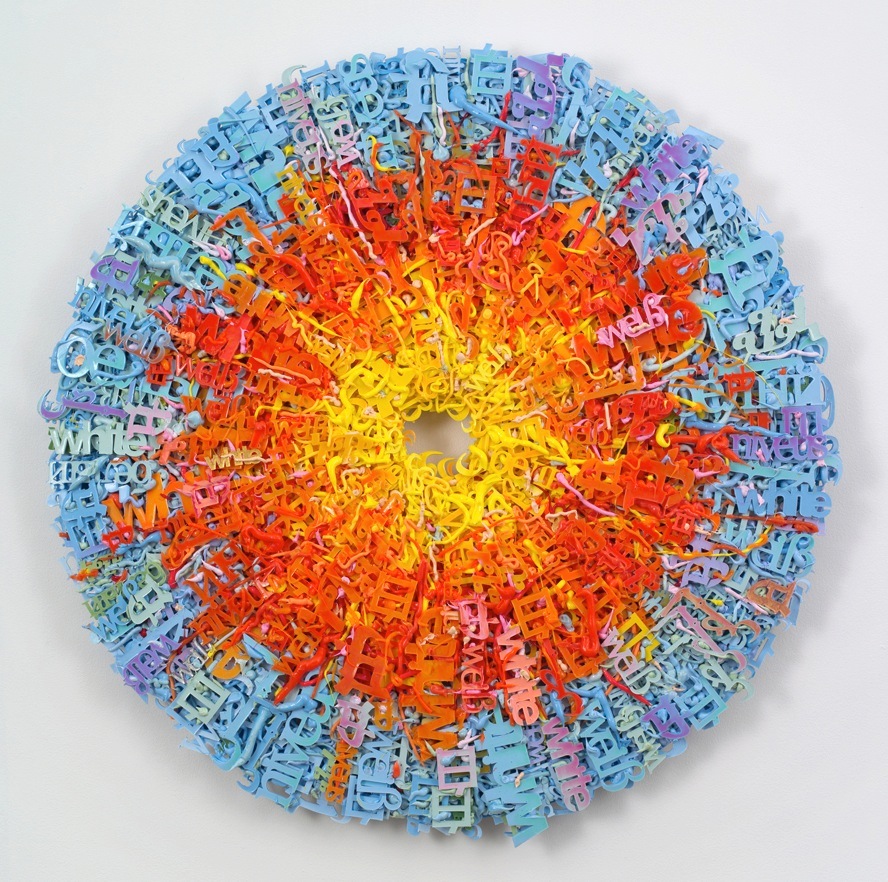

This next piece is one of my favorites because of the way composition and color come in to play. Yael states she drew the inspiration for this piece from Talmudic commentary arguing that "an idea can exist in two contradicting states- be a truth and a parable at the same time." This piece emphasizes this concept though its use of the word white, again in several languages, clumped around the edges of the pallet in bold black forms. This on its own demonstrates that white is more of a concept than a single unifying truth especially because the center of the piece appears more like white when contrasted with the black edges. The style of this piece is beautiful to me because it makes the words look as though they are somewhat alive or frozen in time. Her work truly reinforces Talmudic commentary by demonstrating the multiple ways "white can be interpreted, created and reinvented.
Possibly one of Yael Kanarek's most impressive works is her Traveler's Journal interactive online experience. I say interactive but I do not mean that people log on and interact with one another. In the Traveler's Journal Kanarek creates a backdrop where a traveler has entered a parallel universe called Sunrise/Sunset. She explains that the laws that govern our world may or may not apply to the traveler on his journey through the land. The traveler leaves letters for his lover along the way and as an audience member you have the ability to follow the traveler as he searches for a treasure that is as ambiguous as the rest of the story. This piece is truly bizarre and follows no recognizable patterns as far as stories go. I understand this piece to be almost a reflection of the human/cyberspace relationship. As people interact with the program data is collected by the program relaying the time and place in the real worl where people are interacting with it; Yael then takes this information and plots almost a map of connectivity on the landscape of Sunrise/Sunset. The images below are examples of this cross mapping. In doing this, Yael shows where the two worlds coincide. I understand the journey to be symbolic for the search and endless adventure that the internet has become, after all it is an entirely new frontier. It really is a brilliant piece and though it is ambiguous at times I believe it makes a glorious attempt at describing the cyber/human relationship.


Tuesday, January 29, 2013


Tech BLog
Monday January 28th, 2012
7:45- Barely wake up to iPhone alarm
8:03- Running late when I receive a phone call from Ben telling me school might be canceled
8:05- Check school mobile web to discover only 8 o'clock classes are cancelled
9:10- Printed homework from email for my 9:20
9:20- Teacher used PowerPoint in class
10:42- Went to Monty, found a nice spot and reading "A Dance with Dragons"on iPhone until class
11:01- Accidentally texted Sarah
11:30- Talked to my Mom on the phone
12:05- Prof. Koy also used a PowerPoint to present her lecture
13:05- Listened to music on iPhone and read more Game of Thrones while waiting for my next class
14:45- Used computers in Goodpasteur basement for Lab
15:22- Used SPSS and Excel
16:50-Used Photoshop in the Media Center to finish working on my collage
17:27-Facetimed my sister in Austria
17:45-Did a voice job for Taylor using audio equipment
20:30- Called my bud to pick me up and take me home
22:05- Played Super Smash Bros. with the housemates
23:09- Set alarm on iPhone and fell asleep watch Cloud Atlas
Monday, January 28, 2013

Thursday, January 24, 2013

Shiny Things

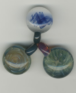

I should mention where I found these amazing little beads both above and below. My housemates older brothers, Daniel and Ryan Eicher, have been blowing glass for years now an have recently started up a small company called Homegrown Glass. Their work is truly magnificent from any distance so I knew they would make for good subjects.
 My other housemate, Paige Burger, is responsible for the off beat necklace to the left. She takes old beer bottle tops and puts cut outs in the center and the finishes the job with varnish. It's hard to say whether they look better in this photo or real life.

 These marbles have been rolling around the floor of my house for months now and until this week I never really noticed them. Finally found a good use for them.

 Snow is really strange to see from this perspective, when scanned it simply looks like ice.
Tuesday, January 22, 2013

Thursday, January 17, 2013
Nancy Burson: Digital Pioneer

Mankind, Nancy Burson, 1983-85
A digital artist of great importance is undoubtedly Nancy Burson. She was born in St. Louise, Missouri in 1948. After she finished painting in Colorado in the late 1960's she moved to New York City and went on to work through Experiments in Art and Technology. Through this program Nancy was allowed to collaborate with researchers from MIT in the development of a program that could manipulate the characteristics of peoples faces. This allowed Burson to map out how people would look throughout their lifespan and upon further work on the program it gave Burson the ability to make composite portraits like Mankind (above) and Warhead (below). Mankind is a composite of Asian, Black and Caucasian faces while Warhead is composite of Ronald Reagan, Brezhnev and several other politicians. She continued making composites for artistic purposes but also used composites to aid in the location of missing children whose facial features may have changed through time.

Nancy's work has changed in structure and purpose throughout the expansion of her career. Pieces like Warhead, Mankind and the Beauty Composites allowed for a unique new perspective on the classic portrait. Never before had anyone had a program such as hers. Mankind is the first of many composites that Nancy made in where it appears she attempted to use technology to overcome the boundaries of different races and ethnicities. Later on she made many human composites that combined the features of men and women to find the a composite for each gender separately and together. By combining the facial features of female actresses Nancy expresses the standards of beauty in our society. Thus, the clear focus of her work was on how the face is a symbol for many things, almost as if it were a mask.
In regards to her medium, Nancy was truly a pioneer. The program she developed with her friends from MIT was remarkable and as was mentioned in the article it's techniques allowed for humanistic composite sketches to be made. This is an important aspect to her career because it draws heavily from the Christiane Paul's concept of using digital technologies as a tool. By aiding in the search of lost children or convicted felons Nancy Burson took the composite portrait to a new realm in which it had applicable use and purpose in society. Christiane Paul wrote about how digital media can allow the observer to see the art as a real person (e.g. a person dancing in a video). Nancy's updated portraits of lost children force to see the artists rendition of the children as the real deal. That is to say her composite work allows the viewer to see the art as an actual portrait of someone even though it is hypothetical. Her ability to composite portraits has made her an invaluable artist of the digital age.

Subscribe to:
Posts (Atom)